Making business personal.
A deep dive into Studio 618’s rebrand.
TL;DR: Studio 618, a signage and wayfinding consultancy, underwent a brand overhaul to better reflect founder Lauren Stern's artful approach to design. The rebrand intentionally broke several traditional branding rules to fully capture the essence of Studio 618. The collaboration with Olive Ridley Studios resulted in a consistent, vibrant brand that truly resonates with Lauren and her audience.
If there's one phrase brand designers mutter more than most, it's this: "Your brand isn't about you; it's about your audience." As true as that guideline is, designers love finding a good reason to break the rules, and the brand we're examining today broke all the rules in the best possible way. Let's dive in.
Who is Studio 618?
Studio 618 is a story-driven signage and wayfinding consultancy based in Charlotte, NC. The studio's founder, Lauren Stern, takes an artful approach to experiential graphic design and wayfinding--relishing in the joy of transforming ordinary spaces into extraordinary experiences.
Since Studio 618's inception in 2021, Lauren has completed more than 60 projects in 36 cities and 13 states. Her business was clearly working, but as its third anniversary approached, Lauren realized her brand wasn't necessarily sending the right message.
Time for change.
The development of a tagline sparked the initial drive for a brand update. After being in business for a couple of years, Lauren realized she wanted to make it more obvious why a potential client would hire Studio 618 over another experiential design firm. What really separates Lauren's work is her artful approach to what can often be an overlooked area of design.
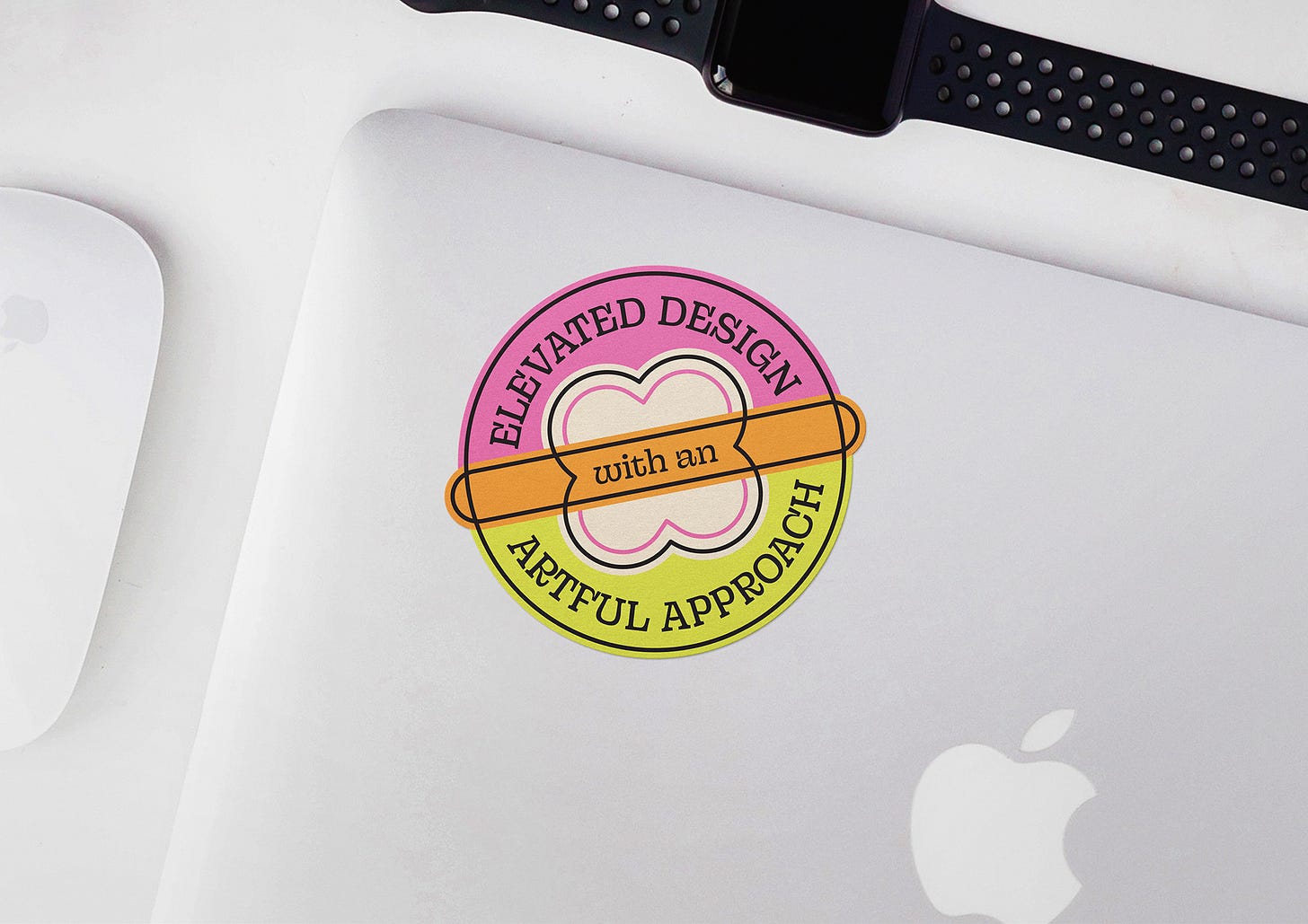
Lauren wants Studio 618 to be known for "Elevated design with an artful approach." Unfortunately, her existing logo and brand identity didn't embody those qualities. It was time for an overhaul. And although Lauren is a brilliant designer, branding isn't her specialty. So, she enlisted our help to develop a new brand identity that would better represent her company ethos.
Breaking the rules with intention.
When we went through the brand discovery process for Studio 618, we uncovered three critical pieces of information that allowed us to break some rules thoughtfully and intentionally.
Lauren is the face of the brand. She prides herself on offering clients one-on-one service.
The people who hire Studio 618 are not the end client.
Studio 618, as a brand, exists almost entirely online.
Let's break each of those down a little further.
Number one: If you hire Studio 618, you'll work directly with Lauren. Potential clients need to know, like, and trust both the brand and the person behind it, making the branding process deeply personal. We needed to consider Lauren's personality when making decisions for her brand. Rule #1: Your brand isn't about you—broken.
Number two: Defining Studio 618's audience was more complex than it is for many brands because of the type of work Lauren specializes in. She does a variety of work for commercial and residential developers, including custom signage and wayfinding, artful focal walls, and parking garage graphics for workplace and multi-family residences. Most people who hire Studio 618 are men over 40, so it might surprise you that we decided to use neon pink as the new primary brand color.
The logic behind that decision came from the knowledge that while men are often in charge of the projects Studio 618 gets hired for, the men leading the projects are not the target audience for the completed development. Project leaders are looking for designers who can infuse personality into developments, making them more attractive to potential buyers. Rule #2: Your brand is about your ideal client—broken.
Number 3: We usually steer clients away from neon colors. They're incredibly hard to reproduce in a physical environment, require specialty inks to be printed, and can drastically increase production costs. But, when reviewing Studio 618, we realized that while Lauren's work resides in the real world, her brand exists almost entirely online. Because of Lauren's expertise, she has more knowledge of color and more experience working with specialty vendors than the average business owner. So, rule #3: Don't use neon colors—broken.
More than just a logo.
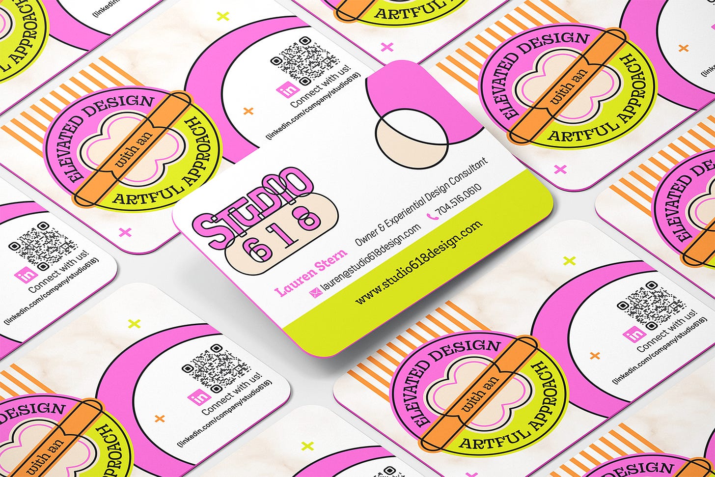
If you're familiar with Olive Ridley Studios, you know we never design just a logo. We always create a visual brand identity, including brand fonts and colors, at a minimum. For Studio 618, we went even further, developing additional brand-specific graphic elements, an icon set, and social media templates. Here's the final result of our work together:
Quick wins, thanks to Studio 618's new brand.
Once we finished developing the new brand identity, Lauren handed the new assets and brand guidelines to her web development team. Having a clearly defined brand with all the extras made the web design process a cinch. Here's what Lauren had to say about it:
“Having a clear set of brand assets that spoke to the essence of what Studio 618 was about elevated the website to a whole new level. Megan, Olive Ridley Studios, provided an assortment of assets ranging from our color palette, icon set, typography, fun shapes and patterns, and even a classy marble pattern. Those assets were what we ended up incorporating throughout the website. Having a custom icon set that told our story and the services we provide elevated the website even more. Everything looked custom and unique, which was what we were going for. Providing a consistent and unique set of assets from various logotypes, to the adorable Dewey the dog mascots, to the brand-specific patterns and vibrant color palette, really helped the web design team get off on the right foot.
Before working with Olive Ridley Studios, my brand was not consistent and lacked the vibrant and artful qualities I try to evoke. Now, with the brand and website relaunch, it is clear as day what Studio 618 is all about. I am so glad that I worked with Megan to create the brand first and then was able to provide my web team with brand assets so everything was consistent. Speaking from experience, you need more than just a logo. These additional assets are necessary for a consistent and unique brand that will stand out above the rest.”
You can see the new website in all its glory here.
Web Designer: Emma McGoldrick (ESM Creative Studio: https://www.emmamcgoldrick.com/)
Web Developer: Steph Powell (The Cont Co.: https://www.thecont.co/)
Since launching the new and improved Studio 618 earlier this year, several people in Lauren's circle have commented on the updated brand, remarking that the new look is "so her," which is the best compliment either of us could have hoped for. Not only does the new brand embody Lauren's personality, but it's also positively impacting her business—most directly by increasing the number of requests that have come through her website since the relaunch.
We're honored to have helped Lauren make big waves with Studio 618 by leaning into her authentic self and unapologetically infusing her personality into her brand.
Ready to build a better brand experience? We'll help you make big waves with your small brand in a way that's "turtley" you. Click here to get started.


